Misery Map
A small British weather site that turns your postcode into a personal weather verdict.
Side project · 6 August 2026
A small British weather site, built for the Lab
Overview
Misery Map (miserymap.cool) takes a postcode and turns it into a personal weather verdict. Enter where you live, and it scores how miserable your bit of Britain currently is, split into a Rain Register and a Heat Register, with a scattering of pun town names and a fair bit of dry British commentary along the way.
It sits in Lab because it's exactly that kind of project, built for fun, shipped fast, and taken just about seriously enough to actually finish.
The spark
The idea started in a coffee shop, half listening to a nearby table moan about the heat. No fans left anywhere. No working air con. One of them audibly wishing for rain.
It's a very British contradiction, we complain about the weather whichever direction it goes, and somehow nobody had built a proper scoreboard for it. That felt like a gap worth filling.
The idea
The concept began simply, postcode in, rain misery out. It quickly became clear that heat deserved equal billing, since British weather complaints genuinely split down that line, and the two together opened up a far better story, the north versus south divide between places that suffer from rain and places that suffer from heat.
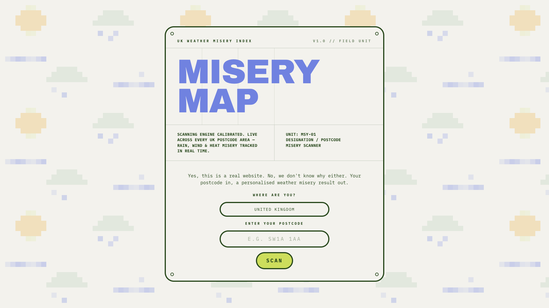
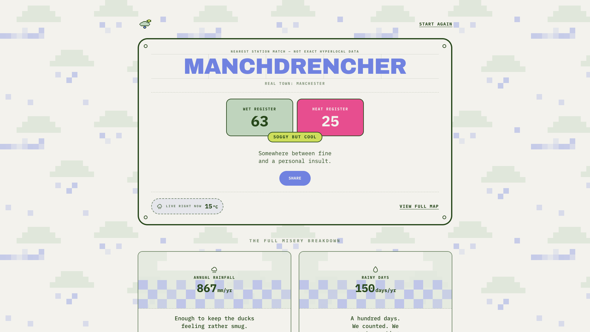
The flow settled into two stages. A short, deliberately understated entry screen, then a personalised reveal, built to be the kind of thing worth screenshotting rather than just reading.
Design direction
The visual language leans into a colour blocked, technical stationery feel, cream backgrounds, sage and pink data panels, chartreuse highlights, dark green line work, and panels styled like bolted on equipment plates. A pixel art logo, a blocky cloud with a stubborn little sun peeking out, ties the whole thing together without taking itself too seriously.
Voice
The copy does a lot of the work here. Each result comes with a bit of commentary, blunt, dry, and occasionally a bit theatrical, closer to the kind of thing you'd overhear than a standard weather app. Certain postcodes carry small easter eggs too, little local in-jokes rather than anything data driven.
Sharing was built to work the way Spotify Wrapped does it, a generated graphic rather than a plain link, so results are actually worth sending on.
Tools
Built in Cursor, deployed on Vercel, scored using real Met Office climate averages. Copywriting and rapid content iteration, headlines, error states, easter eggs, leaned on an AI assistant to explore a lot of tone and options quickly, with final calls made by hand.
What's next
A gamified head to head mode, comparing two postcodes directly, is sketched out and parked for a future update.